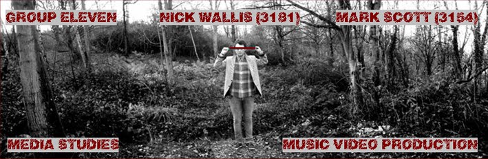


Posted by Nick
(To see an enlargement of each image, simply click on it and it will open in a larger size on a new window.)
Above are the final print layouts for both our digipak and magazine advertisement.
The images were taken in the same location as our video, this being the Tonbridge Woodland. We thought these images from this location would be really effective, as they sum up the tone of Peñate’s sound; very natural intertwined with sounds from various influences.
We both gave our ideas of what we thought the images should be of for both the advert and the digipak, and we came to the conclusion that we should try to depict Peñate coming into a ‘new’ world to coincide with the album’s title ‘Everything Is New’. We finally decided that Peñate should be shown in the images to be blindfolded, later taking off the mask to see this ‘new’ world.
For the digipak front cover we used a CU to sell the ‘brand’ of Peñate, the audience seeing the artists face and thus linking him to other previous work. We also used the idea of the first person mode of address, looking at the camera and thus identifying himself with the audience, creating a very personal image. The interior of the digipak included an image of me as Peñate, blindfolded, standing on the pathway leading into the woods, and where the CD would be placed, we had a very simple image of the woodland by itself, with two trees filling the foreground. The back of the digipak was an image of me as Peñate, blindfolded, with the text on the left hand side, and thus this image adhered to the rule of thirds. We also had to include information on the copyright, a barcode, and any promotional information that we saw necessary, thus we gave the web addresses for Peñate himself, as well as the label group XL recordings.
For the advert we used similar images, however we chose to use a wide angle shot for the advertisement which measured 4cm x 7.2cm. To achieve this wide angle shot, we took three separate images, panning the camera after each so that we could, in the editing process, combine all three to give the appearance of one wide image. When taking the images, we made sure that I, as Peñate, was positioned in the second image, and thus in the middle of the final image. We positioned the text around the images so that the attention of the audience was drawn towards the artist, again, ‘selling the brand’ of Peñate. On the advertisement we included various pieces of information, including the artists and albums name, magazine reviews from companies associated with the ‘Indie’ genre, including NME, Mojo and Kerrang, promotional information such as the artists and record labels web addresses and UK tour dates with the locations and the relevant information to book tickets. All these pieces of information are commonplace on magazine advertisements as the record labels wishes to sell the artist as much as possible.
For both the digipak and the advertisement, we decided to put them in black and white. However, when we did this in Microsoft Word, the images were very dark and not a lot could be seen. So, after a while of altering the images brightness and contrast, we decided on putting all images in greyscale, and then changing the brightness to +20%, and the contrast to -10%. This then gave the appearance that the images were in black and white, but all the relevant information could be seen clearly.
The typography on both the advertisement and the digipak was put into a burgundy colour on Microsoft Word. I thought that this colour was symbolic of the autumnal feel of our music video, and thus this would connote once again to the audience the albums sound.
Once I had put all the text in this burgundy colour and later put it over the images, it was very hard to read. To solve this problem I highlighted each set of text and gave it a grey background so that the audience could see the text clearly.
No comments:
Post a Comment